|
I love when I come upon this type of visual inquiry! Hats off to Mr. Pandurangan!
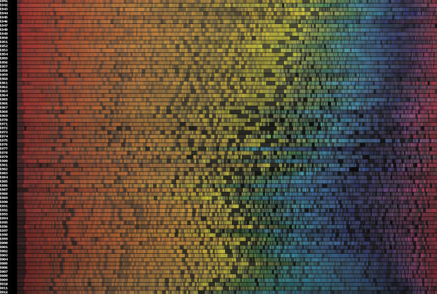
Software engineer Vijay Pandurangan analyzed 35,000 posters from 1914 to present day and came up with the visual representation pictured above. His theory was that over the years our color bias, at least where movie posters are concerned, has gone more dark and blue. If you’re interested in seeing the full results, including an interactive version, head over to his blog for a more in-depth look at the experiment.
1 Comment
PJ
11/6/2013 04:01:34 am
Wow!
Reply
Leave a Reply. |
check itclaire a warden |

 RSS Feed
